

Why Your Annual Report Cover Page Design Matters Most
 Share
Copy Url
Share
Copy Url
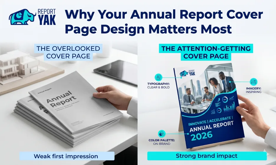
Your annual report cover page design is the first thing anyone sees. Before a stakeholder reads a single number or browses through your achievements, they judge the cover. That split second shapes their first impression of your entire company.
Think of it this way. A well-designed cover speaks volumes without saying a word. It tells your audience that your brand is credible, your work is quality, and your story is worth reading. A weak design, on the other hand, can quietly undermine all of that.
Good design does more than look pretty. It communicates your tone, reflects your brand identity, and sets the stage for the rest of the report. Every element, from the imagery and typography to the color palette and company name placement, plays a role in how readers engage with your document.
Yet, many businesses treat the cover as an afterthought. They focus all their energy on the content inside and rush the most visible part of the entire report. That's a missed opportunity.
A strong annual report cover page design helps your report stand out, resonate with your audience, and leave a lasting impression. Whether you're a large corporation or a growing institution, the cover is your chance to make a bold, on-brand statement from the very first page. This guide walks you through everything you need to know to get it right.
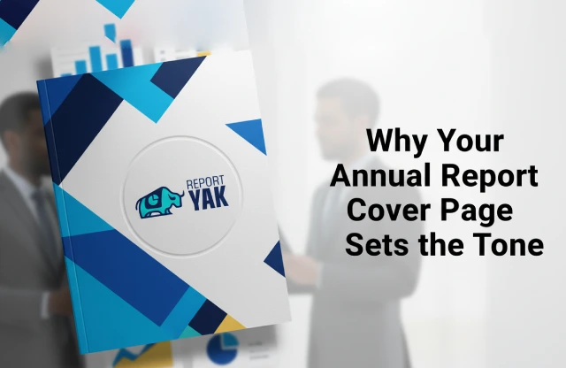
1. Why Your Annual Report Cover Page Sets the Tone
The cover page of your annual report carries more weight than most people realize. It's not just a formality. It's a strategic communication tool that shapes how your audience feels about your company before they read a single word inside.
The First Thing Everyone Sees
Stakeholders, investors, and board members are busy people. They receive a lot of documents. When your annual report lands in their hands, the cover is the first thing they notice. In those first few seconds, they're already forming an opinion. Is this company organized? Do they take their work seriously? Does this report deserve my attention? Your cover answers all of those questions silently.
A Weak Design Can Cost You Credibility
A poorly designed cover doesn't just look bad. It sends the wrong message. It can make even a financially strong, well-run company appear careless. Readers may question the quality of the content inside before they've even opened the document. That's a serious risk for any business or institution.
A Strong Cover Builds Instant Trust
On the flip side, a strong annual report cover page design communicates professionalism and stability right away. It signals that your team pays attention to detail. It shows that your brand has a clear identity and that you value how you present yourself to the world. That kind of confidence is reassuring to stakeholders.
Think of It Like a Storefront Window
Here's a simple way to think about it. Imagine walking past two shops. One has a clean, well-lit, visually appealing window display. The other looks cluttered and dim. Which one do you walk into? Your report cover works the same way. It's your storefront window. It either draws readers in or gives them a reason to disengage. A firm handshake makes a great first impression, and so does a cover that's thoughtfully designed and on-brand.

2. Key Elements of an Effective Annual Report Cover Page
A great annual report cover page design doesn't happen by accident. It's the result of smart, intentional choices. Every visual element on that cover, from the colors to the fonts to the layout, plays a specific role. Here's a breakdown of what really matters.
Brand Identity and Visual Consistency
Your cover should feel like a natural extension of your brand. That means your logo, brand colors, and typography all need to align with how your company presents itself everywhere else. Think of your website, your marketing materials, your social media presence, the cover should feel like it belongs to the same family.
Visual inconsistency sends the wrong signal. When the cover looks different from everything else your company produces, stakeholders notice. It can make your brand appear disorganized, even if the content inside is excellent. Consistency, on the other hand, builds familiarity and trust.
Typography and Hierarchy
Font choices shape how professional your report feels at a glance. Clean, legible typefaces convey confidence and make the document easier to engage with. Decorative or mismatched fonts, however, can distract the reader and weaken your report's credibility.
Visual hierarchy guides the reader's eye in the right direction. Your company name, report title, and year should stand out clearly. Everything else supports those key elements. As a general rule, sticking to two font families on the cover is enough, any more and the design starts to feel busy and unbalanced.
Imagery and Layout
High-quality photography or custom illustration can dramatically elevate the perceived value of your report. Generic stock images, on the other hand, can make even a well-structured cover feel impersonal and forgettable. The imagery you choose should reflect your company's actual work, values, and character.
White space is one of the most underrated design tools available. It's not empty, it's breathing room. It draws attention to what matters and signals that the design is considered and confident, not rushed. A grid-based layout works in a similar way. It keeps every element anchored and prevents the cover from feeling cluttered or chaotic.
Color Psychology
Colors communicate before words do. Blue signals stability and trust, which is why it's a popular choice in finance and governance. Green speaks to growth and sustainability. Red commands attention but can feel alarming if overused. The colors on your cover quietly set the emotional tone for the entire report.
Your color palette should also suit your industry and your audience's expectations. A bold, high-contrast palette might work well for a technology company, but it could feel out of place for a heritage financial institution. Beyond that, avoid chasing design trends too closely. A trendy palette can date your report quickly and make it feel less credible over time.
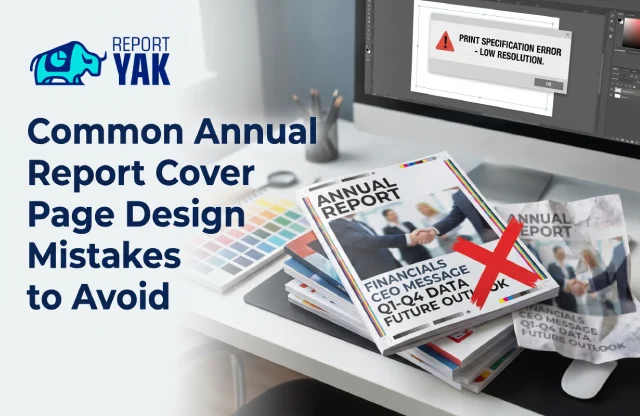
3. Common Annual Report Cover Page Design Mistakes to Avoid
Even well-intentioned teams make avoidable mistakes on their report covers. The good news? Most of these are easy to fix once you know what to look for. Here are the most common missteps and why they matter more than you'd think.
Packing Too Much Onto the Cover
Many companies fall into the trap of treating the cover like a content page. They load it with text, data highlights, and multiple messages all at once. The result? A cluttered, overwhelming design that gives the reader no clear place to look. A strong cover keeps it simple. One clear message, one visual theme, and just the key details, company name, year, and report title, are all you really need.
Relying on Generic Stock Images
Stock photography is a convenient resource. But when it's used without thought, it can make your cover feel hollow and impersonal. Readers can tell when an image has nothing to do with your company, your team, or your work. It breaks the visual connection between your brand and your report. Whenever possible, use real photography or custom illustration that actually reflects who you are.
Ignoring Print Specifications
A design that looks sharp on a screen doesn't always translate well to paper. Colors shift, fonts can blur, and image quality can drop significantly in print. Many companies skip this step entirely and only notice the problem once the reports are already printed. Working with the correct color format, resolution, and bleed settings from the start saves a lot of frustration and reprinting costs.
Mismatching the Cover and the Content Inside
Your annual report cover page design sets an expectation. If the cover looks bold, modern, and vibrant but the rest of the report looks flat and inconsistent, it creates a jarring experience for the reader. The visual language of the cover should carry through the entire document. Think of the cover as a promise, the inside needs to deliver on it.
Treating the Cover as an Afterthought
This is the most common mistake of all. Many businesses pour enormous effort into the financial data, the narrative sections, and the layout of the inner pages. Then, with very little time left, they rush the cover. But the cover is the first thing anyone sees. It shapes the reader's entire perception of the document before they've read a single word. Giving it the same level of care and strategic thought as the rest of the report isn't just good design practice, it's good communication.
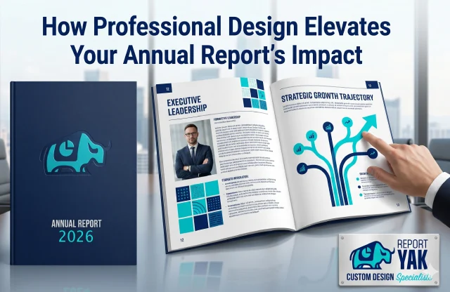
4. How Professional Design Elevates Your Annual Report's Impact
There's a clear difference between a report that looks designed and one that truly is. Professional design isn't just about making things look good. It's about making your report work harder for your brand, your stakeholders, and your business goals.
Balancing Aesthetics With Communication
Professional annual report designers don't just think about visuals. They think about the message behind every design choice. A well-placed image, a carefully chosen color, and a clean layout each of these elements helps convey your company's story more clearly. The goal is always to make the content easier to understand and more compelling to engage with. Good design and good communication go hand in hand.
A Well-Designed Report Gets Read
Here's something worth considering. A visually strong report is far more likely to be read, shared, and kept. When a report looks high quality, readers treat it that way. They're more inclined to spend time with it, pass it along to colleagues, and reference it later. A report that looks rushed, on the other hand, often gets skimmed or set aside entirely.
Design Signals Governance and Credibility
Investors and stakeholders pay attention to the details. A professionally designed report sends a quiet but powerful message: this company takes its responsibilities seriously. It shows that the business values clarity, transparency, and presentation. For companies looking to build or strengthen stakeholder confidence, that signal matters more than most people realize.
Custom Design vs. DIY Templates
Template-based design tools have their place. They're quick, accessible, and budget-friendly for smaller projects. But they come with real limitations. Templates are built to suit everyone, which means they're rarely the perfect fit for any one brand. A custom approach, on the other hand, is built entirely around your brand identity, your audience, and the specific story your report needs to tell. The difference in quality and impact is easy to spot.
How Report Yak Approaches Annual Report Design
Report Yak specializes in creating annual reports that are both visually compelling and strategically on-brand. The team doesn't start with a template. They start with your brand, understanding your visual identity, your audience, and the achievements and milestones your report needs to highlight. Every design decision, from the cover to the final page, is made with your goals in mind. The result is a document that doesn't just inform. It impresses.
A strong annual report cover page design is where that process begins. And when it's handled by specialists who understand both design and communication, the difference shows right from the very first page.
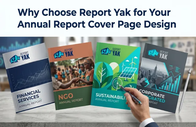
5. Why Choose Report Yak for Your Annual Report Cover Page Design
Choosing the right design partner makes a real difference. You need a team that understands your brand, knows how to communicate visually, and can deliver a finished product you're proud to share. That's exactly what Report Yak is here for.
Experience Across Industries and Report Types
We've worked with companies across a wide range of industries, from financial services and corporate businesses to NGOs, institutions, and sustainability-focused organizations. That breadth of experience means we understand what different audiences expect and how to create designs that resonate with them. Every sector has its own tone, and we know how to strike the right one. Whether it's an annual report, an integrated report, or a sustainability report, we bring the same level of craft and strategic thinking to every project.
Turning Your Brand Guidelines Into Something Striking
Most companies already have brand guidelines. The challenge is translating them into a cover that's not just on-brand but eye-catching. We take your existing visual identity, including your colors, typography, logo, and overall tone, and build a cover that feels like the best version of your brand. The result is a design that's recognizably yours, but elevated.
End-to-End Support, From Concept to Final Files
We handle the entire process. From the initial brief to the final delivery, you're covered at every step. We prepare both print-ready and digital-ready files, so your report looks exceptional whether it's sent as a PDF, published online, or printed and distributed in person. You don't have to worry about technical specifications or last-minute format issues, we take care of all of it.
A Process Built Around You
Here's how it works. We start by getting to know your brand, your audience, and what this particular report needs to communicate. Then we move into concept development, where we explore visual directions that suit your goals. Once a direction is approved, we refine the design and prepare the final files for both print and digital use. It's a clear, collaborative process with no surprises.
See the Work for Yourself
The best way to understand what we do is to see it. Our showcase features annual report cover page design work across a variety of industries and formats, each one crafted to reflect the client's brand and engage their audience. We'd encourage you to take a look and see the quality and range of what we deliver.
If you're ready to create an annual report that makes a strong, lasting impression from the very first page, we'd love to hear from you.
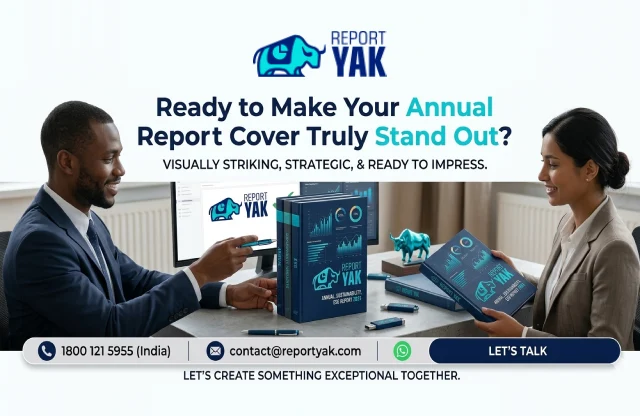
Ready to Make Your Annual Report Cover Truly Stand Out?
Your annual report cover page design is more than a formality. It's your brand's first impression, your credibility on display, and your chance to show stakeholders that your company means business. Every element, from the imagery and color palette to the typography and layout, shapes how your audience feels before they read a single word inside.
A well-designed cover doesn't just look good. It builds trust, communicates professionalism, and makes your report something people actually want to engage with. That kind of impact is worth investing in.
At Report Yak, we specialize in designing annual, sustainability, and ESG reports that are visually striking, on-brand, and built to impress. We work with businesses and institutions across industries, and we bring the same level of care and craft to every project, from the cover to the final page.
Want to see what's possible? Head over to our Showcase page to explore the reports we've designed across a range of sectors and formats. The work speaks for itself.
When you're ready to get started, we'd love to hear from you. Call us on 1800 121 5955 (India), email us at contact@reportyak.com, or reach out via WhatsApp or the Contact Form on our website. Let's create something exceptional together.
Related Posts
-
The Corporate Responsibility Report: Purpose, Value, and Impact
Jun 5, 2026Share


 Copy Url
How to Craft a High-Impact Company Annual Report
Feb 27, 2026Share
Copy Url
Integrated Reporting Made Easy For Modern Companies
Dec 31, 2025Share
Copy Url